Branding
Keshet
Non-Profit / Social Services
Keshet approached us during a phase of growth, expanding from a children-focused organisation to also supporting teens, young adults, and parents.
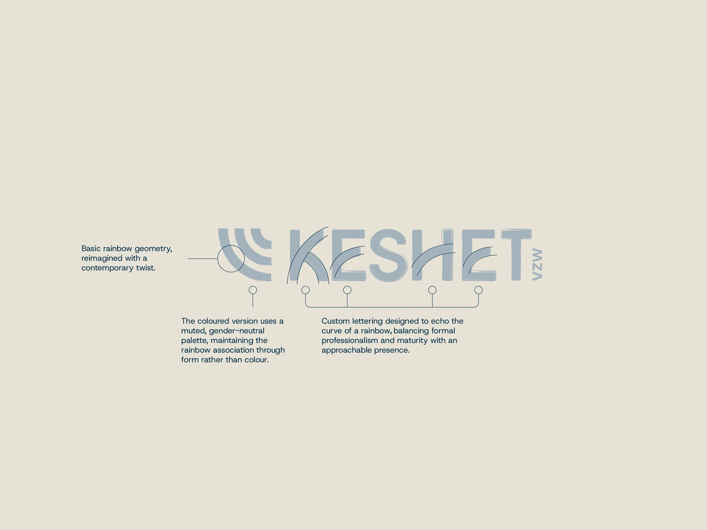
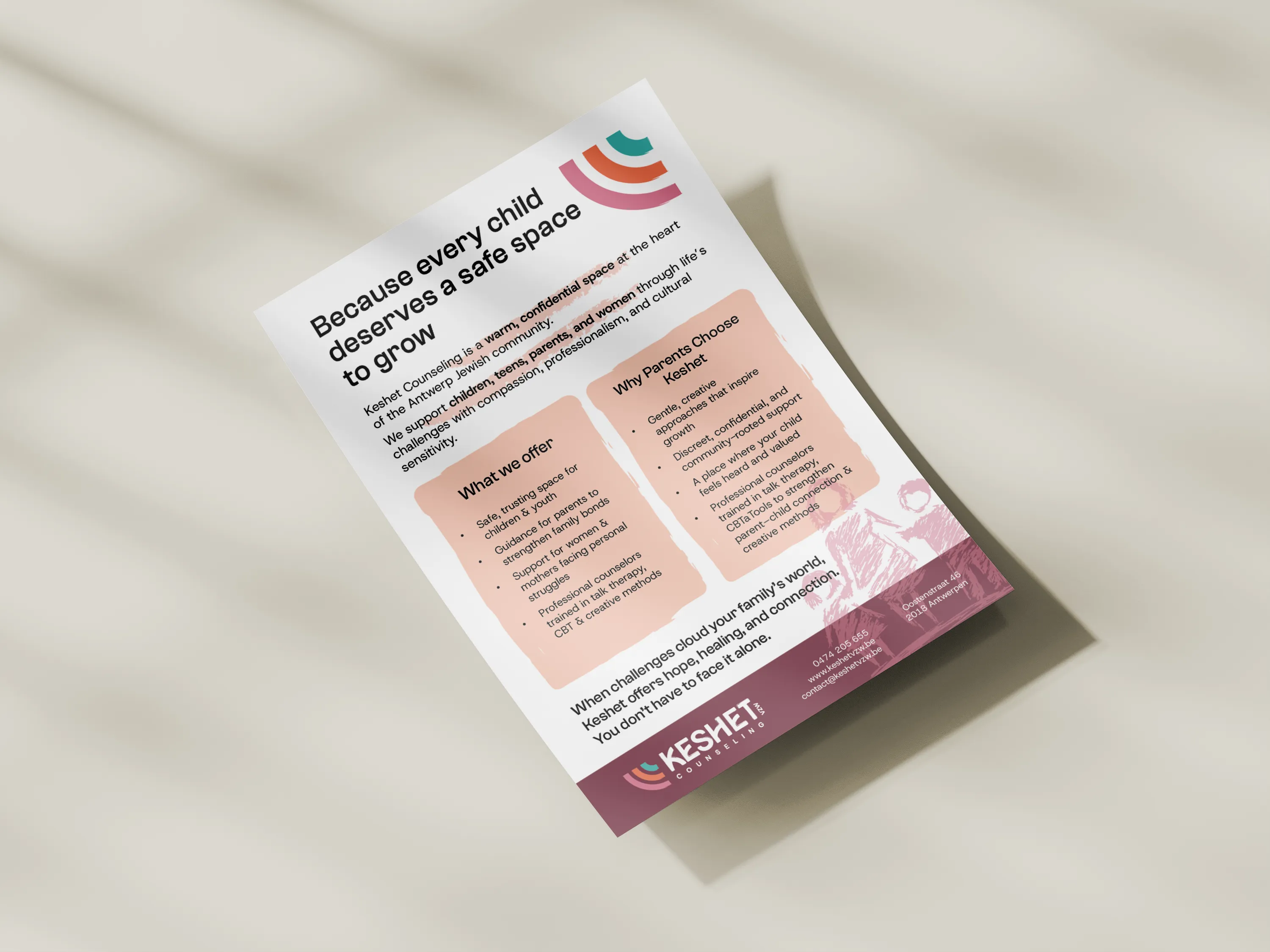
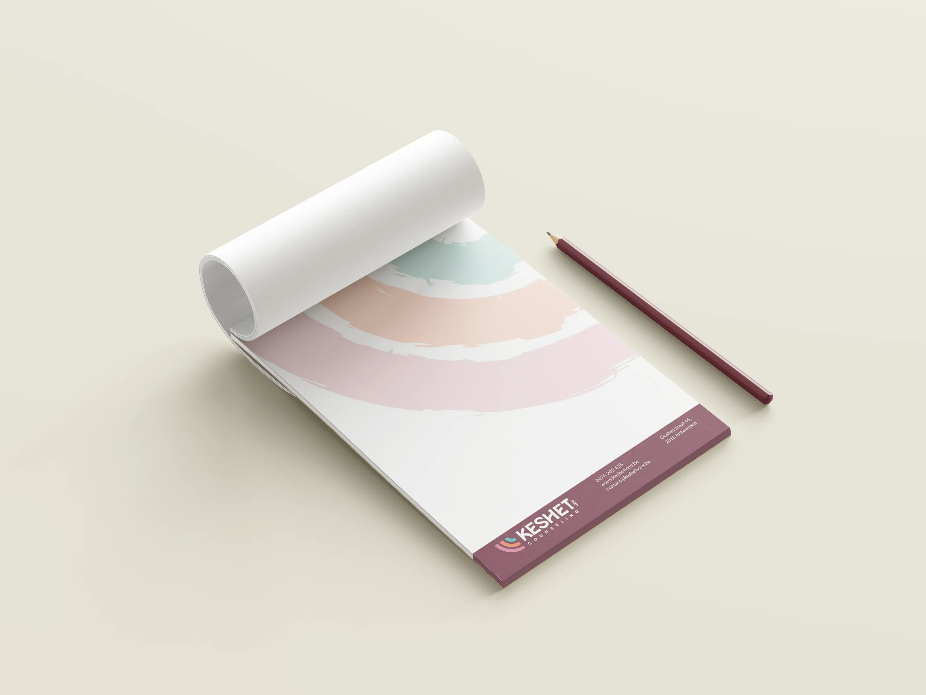
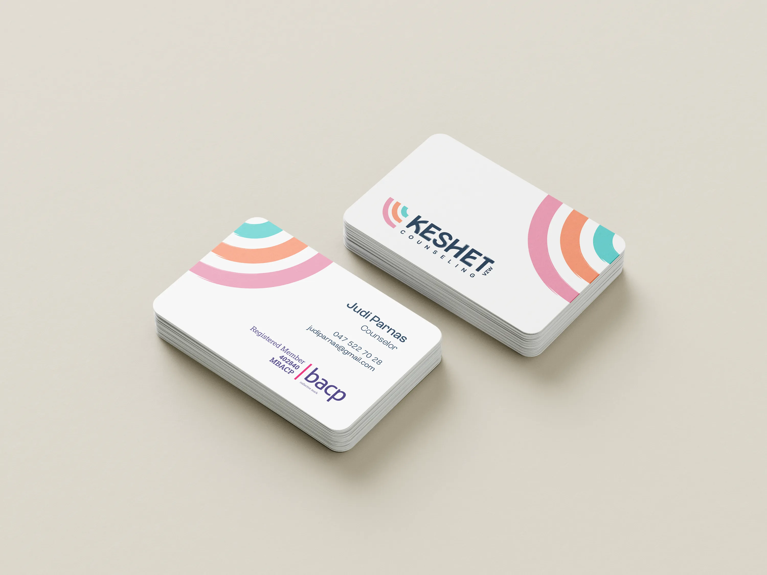
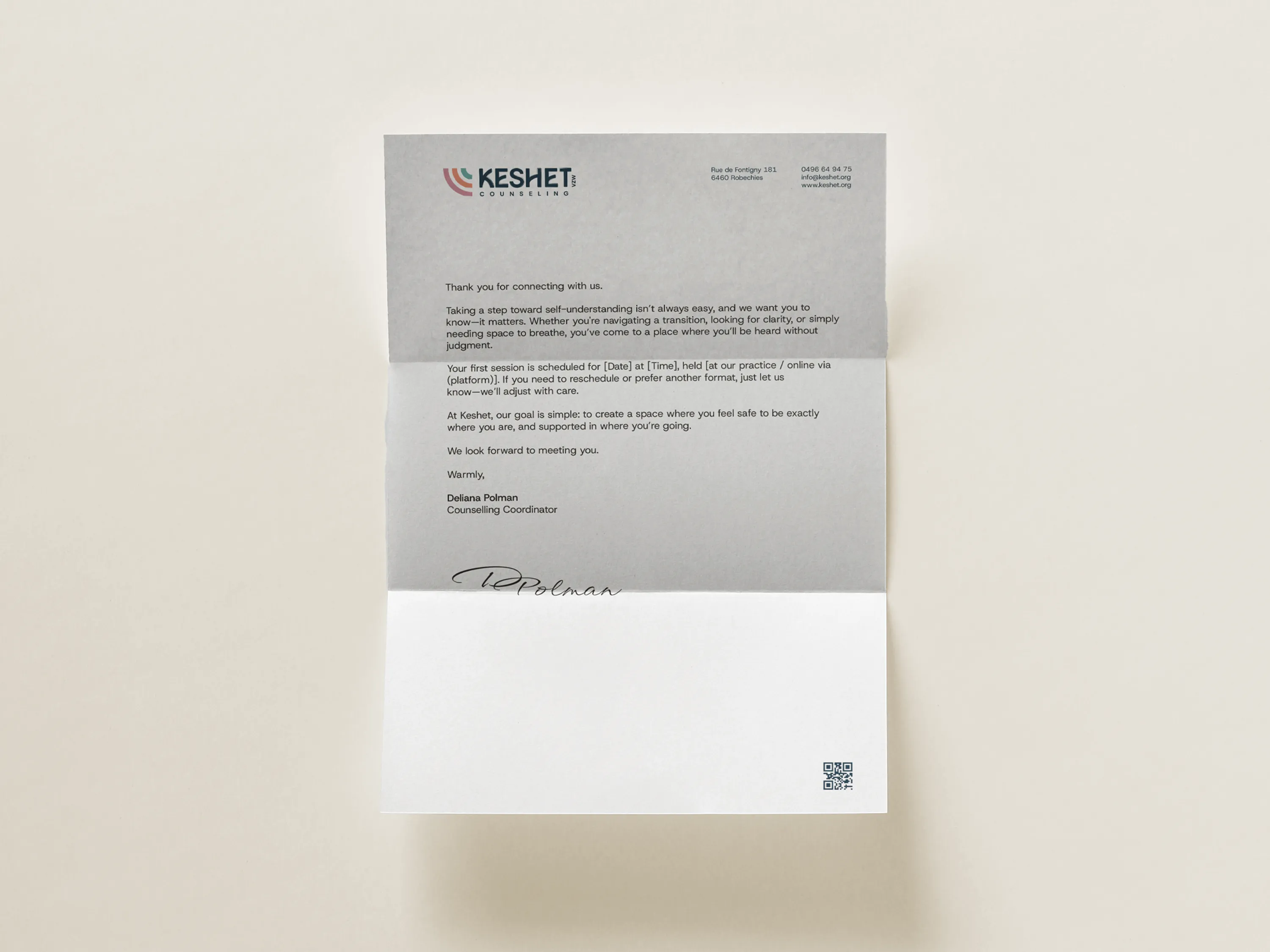
The goal was to evolve the brand without losing its identity. We refined the visual system — keeping the recognisable rainbow — while introducing more structure, clarity, and a more mature tone.
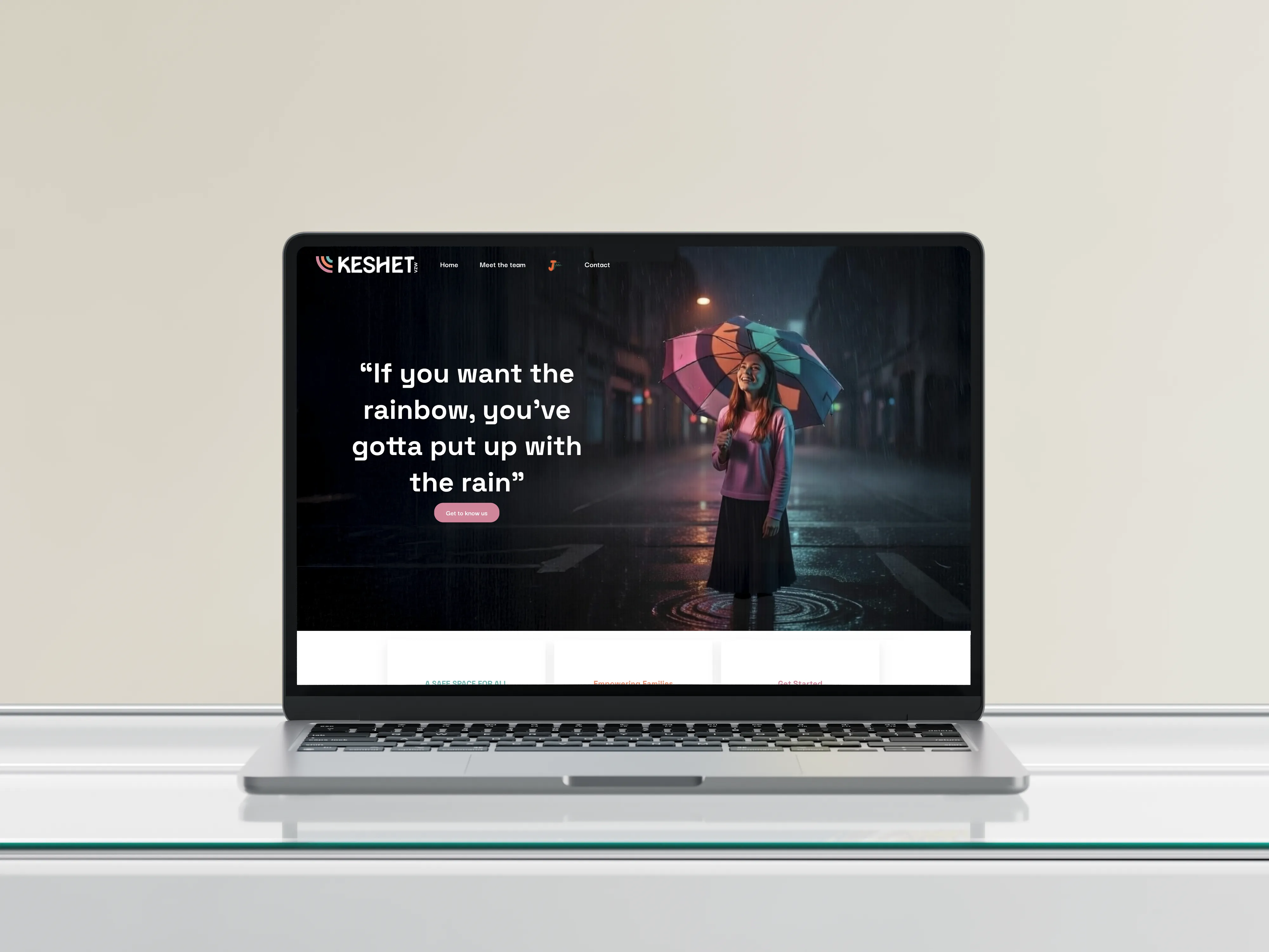
Alongside the rebrand, we redesigned the website to improve navigation and make it immediately clear who Keshet supports and how.
The result is a brand that feels more focused, considered, and aligned with its wider audience.
De uitdaging
The challenge was to bring maturity and clarity to an existing identity, aligning it with a wider audience, without losing the emotional value already associated with the brand.